07 · A plot is an argument
A plotting library can render almost anything. Scientific judgement determines what should be rendered and what conclusion the figure can support.
Decision: which visual encoding tests the stated claim?
Output: a deterministic figure backed by reduced data.
Frame
Suppose the claim is:
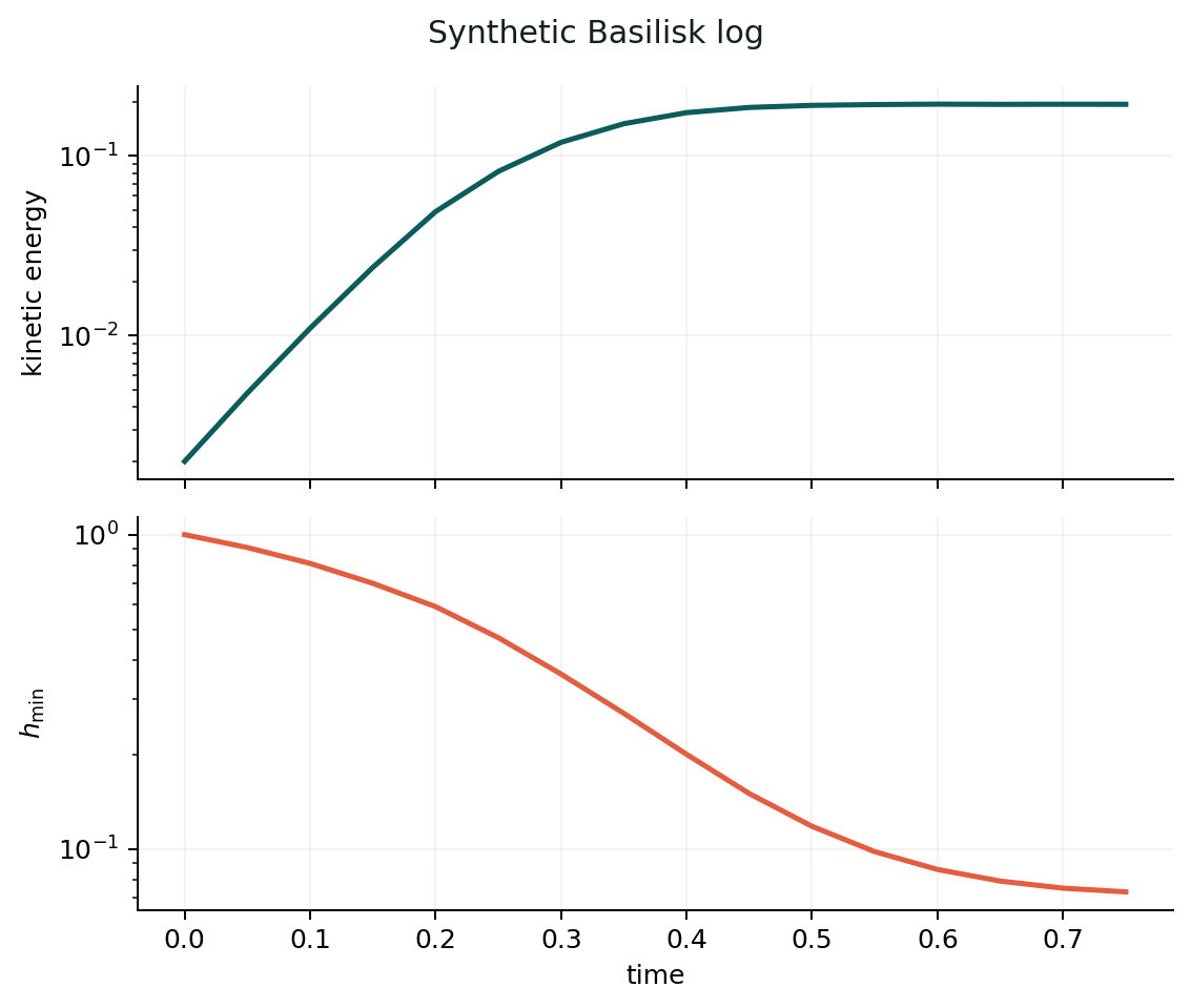
kinetic energy approaches a plateau while the minimum length scale continues to shrink.
The figure needs both quantities against the same time coordinate. Their scales may differ by orders of magnitude, so two aligned panels are clearer than two unlabelled axes overlaid.
Predict
Before plotting:
- Which axis is independent?
- Are quantities dimensional or nondimensional?
- Which trends should be monotonic?
- Is zero possible on a log axis?
- What visual comparison carries the claim?
- What data must remain available behind the figure?
Start with the claim
figure, axes = plt.subplots(2, 1, sharex=True)
axes[0].plot(time, kinetic_energy)
axes[1].plot(time, minimum_length)
Then make meaning explicit:
If values are dimensionless, say so in the caption or symbol definition. If they have units, include them.
Linear, log, and normalised scales
Use a log scale when ratios and power laws are the comparison. Do not use it to make a weak trend look dramatic.
On log axes:
- values must be positive;
- multiplicative spacing is visible;
- a straight line suggests a power law only over the shown range;
- fitted exponents need a declared window and uncertainty.
Normalisation is a physical decision:
Name the scale and justify it. “Nondimensional” is not enough.
Encode categories accessibly
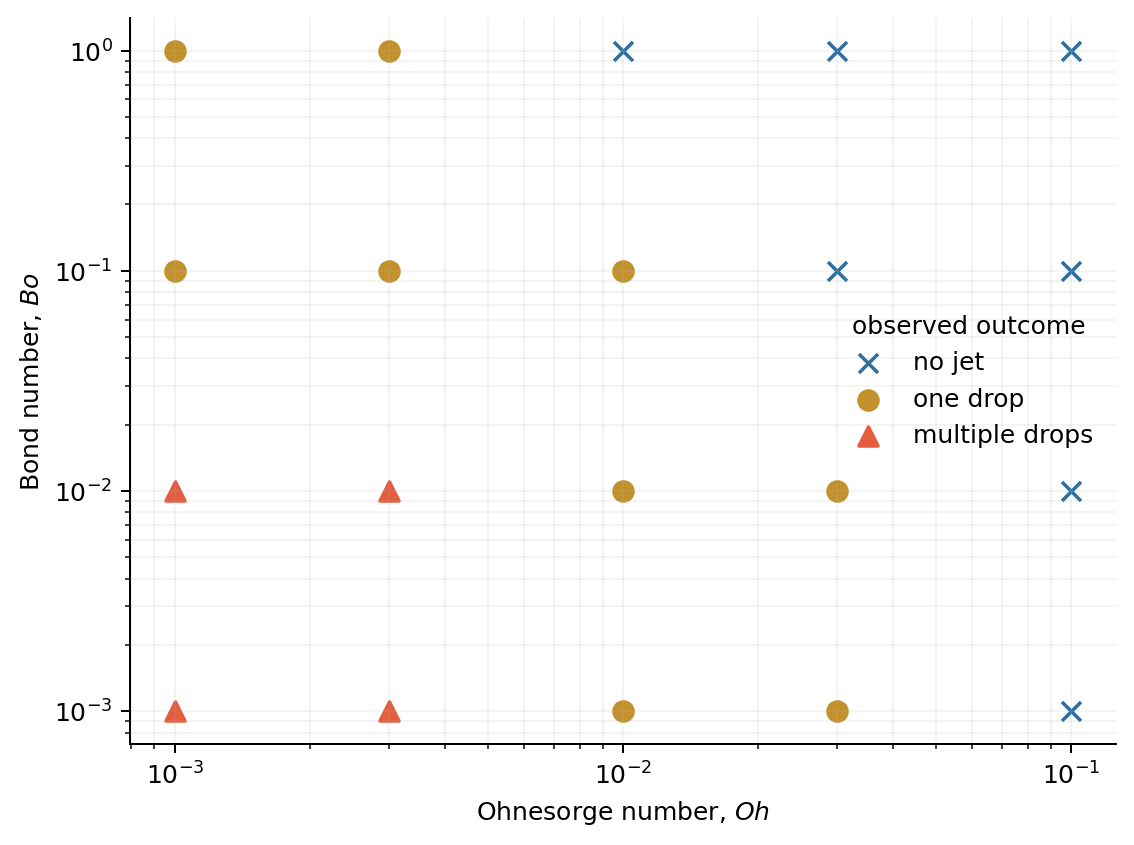
For a regime map, use both colour and marker:
The figure remains interpretable when printed in greyscale or viewed with colour-vision deficiency. Direct labels often beat a distant legend.
Defaults are not neutral
Check:
- axis limits;
- aspect ratio;
- tick precision;
- legend order;
- line and marker overlap;
- font size at final publication width;
- whether a colour map is sequential, diverging, or categorical.
Never connect unordered categories with a line. Never draw a smooth regime boundary simply because an interpolator is available.
Save deterministically
A shared script should save an output and exit. plt.show() is useful during
exploration but fails on headless batch machines and cannot serve as a build
contract.
Keep figure creation inside a function so tests can check that an output is written and source arrays remain unchanged.
The course reference functions are intentionally modest:
"""Deterministic figures for the teaching workflows."""

from pathlib import Path

import matplotlib.pyplot as plt
from matplotlib.axes import Axes

from .io import RegimeCase, SimulationLog

INK = "#13201f"
TEAL = "#0b5d5b"
BLUE = "#2f6f9f"
CORAL = "#e45d3f"
GOLD = "#c3912c"


def _output_path(path: str | Path) -> Path:
    output = Path(path)
    output.parent.mkdir(parents=True, exist_ok=True)
    return output


def plot_log(log: SimulationLog, output: str | Path) -> Path:
    """Save a two-panel time-series figure from a validated log."""

    destination = _output_path(output)
    figure, axes = plt.subplots(2, 1, figsize=(6.4, 5.4), sharex=True)

    axes[0].plot(log.time, log.kinetic_energy, color=TEAL, linewidth=2)
    axes[0].set_ylabel("kinetic energy")
    axes[0].set_yscale("log")

    axes[1].plot(log.time, log.minimum_length, color=CORAL, linewidth=2)
    axes[1].set_xlabel("time")
    axes[1].set_ylabel(r"$h_{\min}$")
    axes[1].set_yscale("log")

    for axis in axes:
        axis.spines[["top", "right"]].set_visible(False)
        axis.grid(alpha=0.2, linewidth=0.6)

    figure.suptitle("Synthetic Basilisk log", color=INK)
    figure.tight_layout()
    figure.savefig(destination, dpi=180, bbox_inches="tight")
    plt.close(figure)
    return destination


def _draw_regime_map(cases: list[RegimeCase], axis: Axes) -> None:
    """Draw validated categorical cases on an existing axis."""

    if not cases:
        raise ValueError("at least one case is required")
    styles = {
        "no-jet": ("x", BLUE),
        "one-drop": ("o", GOLD),
        "multiple-drops": ("^", CORAL),
    }

    for outcome, (marker, colour) in styles.items():
        selected = [case for case in cases if case.outcome == outcome]
        if not selected:
            continue
        axis.scatter(
            [case.ohnesorge for case in selected],
            [case.bond for case in selected],
            marker=marker,
            color=colour,
            label=outcome.replace("-", " "),
            s=58,
            linewidths=1.4,
        )

    axis.set_xscale("log")
    axis.set_yscale("log")
    axis.set_xlabel(r"Ohnesorge number, $Oh$")
    axis.set_ylabel(r"Bond number, $Bo$")
    axis.spines[["top", "right"]].set_visible(False)
    axis.grid(which="both", alpha=0.18, linewidth=0.6)
    axis.legend(frameon=False, title="observed outcome")


def plot_regime_map(cases: list[RegimeCase], output: str | Path) -> Path:
    """Save a labelled Oh–Bo regime map."""

    destination = _output_path(output)
    figure, axis = plt.subplots(figsize=(6.4, 4.8))
    _draw_regime_map(cases, axis)
    figure.tight_layout()
    figure.savefig(destination, dpi=180, bbox_inches="tight")
    plt.close(figure)
    return destination
A figure is not the data
Ship the reduced table used to draw it. A reader should be able to:
- inspect exact values;
- change an axis choice;
- test another normalisation;
- reproduce the figure without raw simulation dumps.
The public
Soft-Matter-Singularities-paper-figures
repository is a strong example of making figure jobs, commands, and expected
outputs explicit.
Verify
Complete Exercise 07, then run the two reference commands:
uv run comphy-python101 plot-log data/basilisk_log.csv \
  --output build/log.png
uv run comphy-python101 plot-regime data/regime_map.csv \
  --output build/regime-map.png
Inspect both at their final display size. Then remove colour temporarily. Do categories and hierarchy survive?
Reflect
Write the claim of your last scientific figure in one sentence. For every visual element, ask whether it supplies evidence, orientation, or decoration. Decoration is allowed. Confusion is not.